


With a greater need than ever for businesses to make real-time decisions, visual evidence is crucial to back up the choices that are made. Whether you’re a stock trader or monitoring a supply chain, having the right charts to spot trends and changes can elevate decision-making and create better business processes. Beyond the usual linear charts, a logarithmic chart is giving new insight into spotting these differences and forwarding growth.
What is a logarithmic chart?
The ability to monitor scenarios in real-time across different perspectives is a tremendous asset, and that’s where logarithmic charts are a game-changer. These charts use a logarithmic, or log scale, rather than a traditional linear scale. The spaces between values on a log scale are different, offering a range of benefits helping to display numerical data over a large range of values rather than compact them. Logarithms are non-linear. “Logs” are another way of writing exponential equations. This allows the separation of the exponent on one side of an equation.
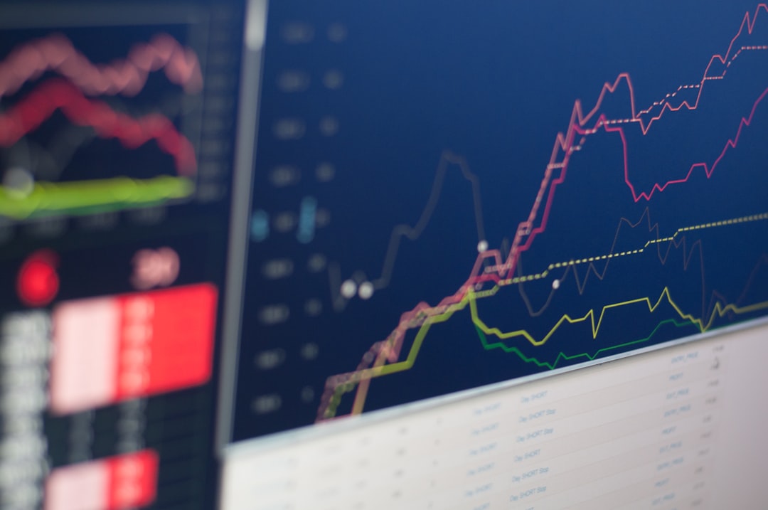
These charts and scales are commonly seen in the stock market. A certain increase in the price of a publicly-traded company becomes less influential while the price gains in value since it is less of a percentage change. Log charts are used for a long-term analysis by traders to observe trends in share prices. A stock chart allows the ability to assess patterns, giving brokers a good idea regarding the future price of a stock based on a certain time period. A logarithmic scale shows greater visuals in percentage terms compared to a linear chart.
Logarithmic Chart and Scale Examples
When dealing with a bulk of data, while combining with a number of factors within a sector, a logarithmic chart is the best presentation of data possible. For example, a dot chart, created with the use of a log scale, is far less cluttered than a traditional bar chart. This clearly shows values on either horizontal or vertical axes. The dots don’t show a value in themselves, unlike a bar or column chart. A line chart can also use logarithmic scales to show trend lines. Candlestick, Kagi, and Renko charts can also show the lengths of trends, representing clear unit changes.
One of the most popular examples of a logarithmic scale is demonstrated through the Richter scale. The Richter scale is the measurement system used by seismologists to determine the severity of shifts across tectonic places, causing earthquakes and tremors. This charts out the release of energy, assessing the difference between lower-degree magnitude, which few people actually feel when they occur. While a linear scale is regular, each magnitude increase represents a tenfold increase in amplitude best demonstrated through a logarithmic chart.
When should I use a logarithmic scale?

Log scales are used when data contains exponential laws, similar to those seen when using the Richter scale. They are also used when data covers a large range of values. The use of logarithms instead of linear values can reduce an axis or chart to a more manageable size. In dealing with the bulk of the data, log charts show a percentage shift. These factors provide greater accuracy over analytics and insight for businesses.
Companies can spot a significant percentage move through the use of log charts and scales. These charts are used for a long-term look. While linear scale charts show off severe price increases, they lack the ability to show a visual representation of more immediate changes. Citing percent change avoids the distortion of data with the help of chart tools that better articulate any increases or decreases that wain on productivity. Overall, it’s about giving the best example possible to make better decisions.